APPROACHES
Layered Design Objects:
Case Study 2 – National Theatre posters
1. THE POSTER
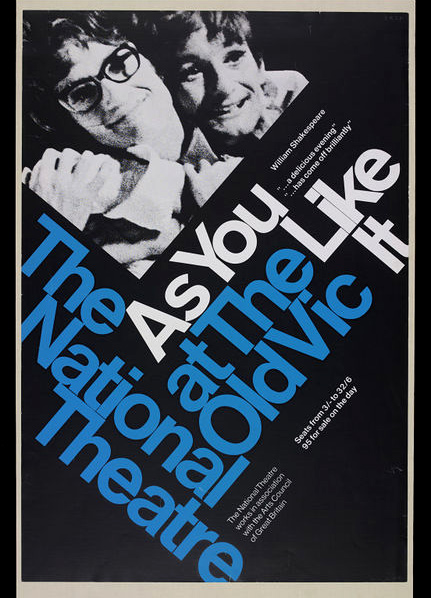
Examples of traditional National Theatre posters have been collected by many UK museum and archives, including those represented by the Posters Network both as examples of design and as documents in the history of performance (figure 2.1). In order to understand how an organisation like the NT, with a long-established and highly acclaimed tradition of poster production, have adapted their approach to design in the last 15 years, we conducted a number of interviews with Charlotte Wilkinson, Creative Director of the Design Studio at the National Theatre from 2009 until 2014. During this phase, digital creation has become ubiquitous, and poster circulation has extended across digital territory. But the new forms in which the National Theatre (and others) produce their poster imagery, are now noticeably absent from museum collections and archives.1
Until around 2003/4, most of the National’s design teams’ output was prepared for print on paper, and distributed for display in theatre ticket halls, underground stations, and urban bus shelters. Today, these traditional poster forms are still in demand, but crucially, they are constituent parts of multi-media campaigns. Wilkinson’s tenure as Creative Director coincided with this seismic shift in what was being asked of commercial posters designers. Posters begun being created using digital tools, for formats that ranged from traditional printed materials to emerging online platforms.
In this context, the online sphere can be thought of as an expansion of urban public space, similarly plotted with eye-catching advertisements. Yet, here, advertisements are designed according to different visual rubrics, to be acted-on (or evaded) by viewers in a new ways. Their aesthetic attributes and formal characteristics correspond to evolving website layouts, new insights into user navigation behaviours, as well as our altered visual attention spans. They also function differently, because digital advertising utilises ‘rich media’ — advertising that includes advanced features such as video, audio and other elements that encourage viewers to interact with and engage with content — and which takes advantage of the fact that online platforms are interconnected.
In conversation with Wilkinson, we explored how traditional commercial graphic design practice has evolved and how our encounters with poster images are transformed in the online environment.
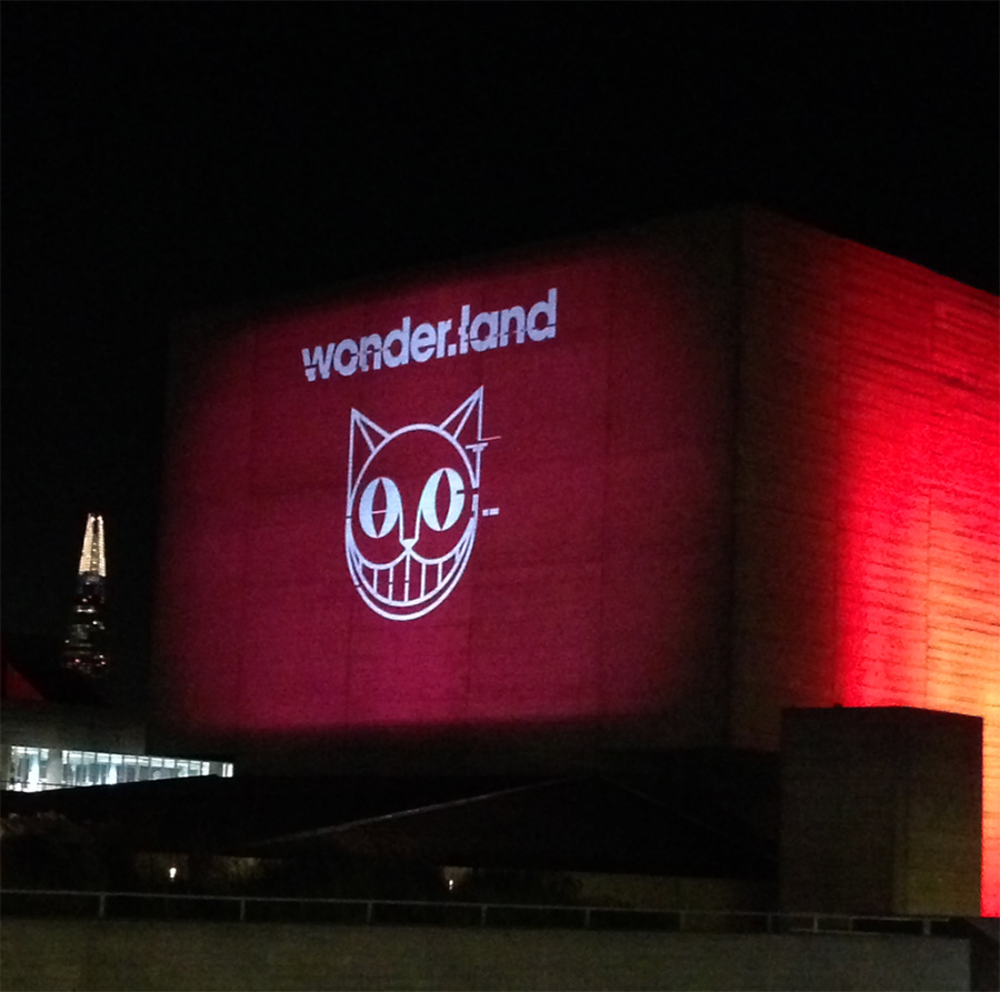 Figure 2.2: Wonder.land campaign image, projected onto the side of the National Theatre building, artwork by Michael Cranston and the National Theatre Graphic Design Studio, 2015. Source
Wilkinson described the transition in her role, from creating singularly striking poster images to designing multifaceted campaigns, appropriate for circulation in the online domain. This involved a shift from creating a static printed advertising posters to creating content for ‘rich media’. For the National Theatre, an early development in this direction (and one that has become central to their marketing campaigns) is the production of teaser trailer — or ‘moving posters’ as Wilkinson says they initially called them — which were shown at NT Live cinema showings and published online on the NT Youtube channel. Usually the filmed footage or animation of the teaser trailer crystalizes in the final frames into a static ‘end card’ or poster image that ties the trailer into a graphic campaign. Wilkinson explained how the production of ‘moving posters’ meant adapting her role from graphic designer to art director and producer, collaborating with multi-skilled teams of set and costume designers, hair and make-up artists, actors and film-makers to create the desired footage.
In addition to the printed poster and teaser trailers. Wilkinson began devising imagery that could be produced across a number of variant formats. When she started working at the NT the key file proportions were equivalent to a ‘four-sheet’ standard-sized theatre poster, the squatter, landscape format ‘quad’ displayed in cinemas, as well as a 16 x 9 screen for theatre productions trailers to be shown in cinemas. As digital outputs became prevalent, this repertoire extended to include templates for web advertisement formats, namely ‘leaderboards’, the wide banners displayed above headers on webpages, ‘MPUs’ the name given to square advertisements, often nested at side margins of webpages, and ‘skyscrapers’ which are narrow, upright advertisements which boarder webpages.
Digital advertising developed at the same time that cultural institutions began embracing embrace marketing and branding as opposed to simply producing promotional graphic design. As the National Theatre expanded its reach (through NT Live for example), marketing became key to building new audiences and creating a profile within a highly competitive entertainment environment. This meant further-reaching publicity campaigns (taking advantage of digital advertising) and the creation of strong ‘visual identities (or ‘total identities’) both for individual shows and for the organisation as a whole.
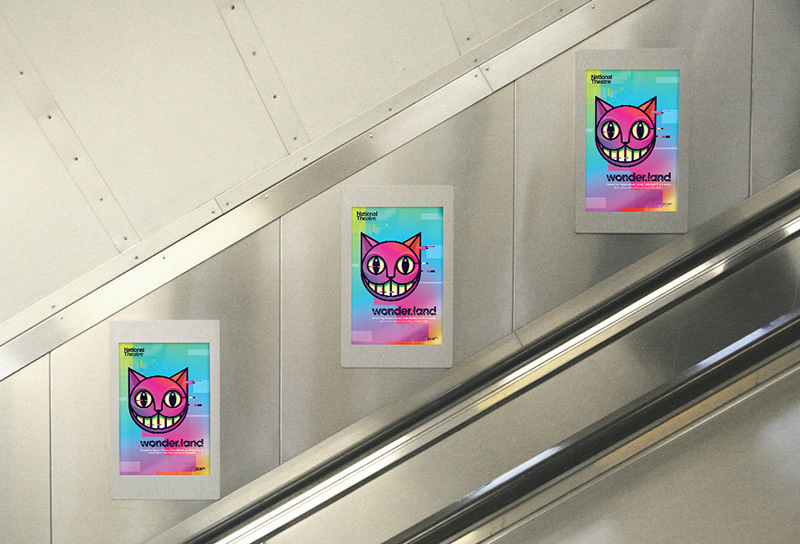 Figure 2.3: Wonder.land digital posters on the London Underground, artwork by Michael Cranston and the National Theatre Graphic Design Studio, 2015. Source
In this context, the designer’s challenge shifted from creating an iconic poster design to creating a mutable image that was strong enough and flexible enough to work across multiple applications, formats and sizes from billboards to thumbnails on a smart phone. Wilkinson recalls:
the reality of the job, as we hurtled through the mid-noughties, was much more about having a vision in 25 different formats… Now it was increasingly less about the poster — strong as the poster seen around the theatre might be — and more about expanding that visual concept into an image for the show. That image also needed to work online.2
The National Theatre’s marketing of wonder.land in 2015 (supervised by Ollie Winser, Wilkinson’s successor at the NT) provides an extreme example of this approach. An grinning cat’s face (the Cheshire Cat) drawn in the style of an app icon (referencing the plot of a play in which the main character enters the internet through an app) became the visual touch stone for the campaign. It was variously adapted for posters and billboards, extracted as a symbol and projected onto the side of the National Theatre building and shrunk down for a specially commissioned app that enabled users to create their own avatar. (figures 2.2—4) As graphic design critic Rick Poynor points out in the introduction to his book ‘National Theatre Posters: A Design History:
The need for a central campaign image to promote the theatre’s productions is as strong as it ever was, but the ‘poster’, as we once understood it, no longer has a fixed edge. It has dissolved into a panoply of media, expanding and contracting as required.3
The expanded online poster requires a different design approach, but it also functions differently to the ‘one way’ encounter between a viewer and a printed poster. Rich media features are activated by users, so online advertisements often invite us to engage. For example, by clicking on a compact advertisement expands it, or by hovering over a static image a user can activate an animated GIF. In the online domain, advertising posters aim to turn passive viewing into interaction, transforming views into click-throughs. This enables one component of a campaign to take a user directly to another, elsewhere on the web as they move through the design of the expanded poster. ‘Leaderboard’ posters with embedded hyperlinks can drive the web user to a trailer on the NT Youtube channel for further enticement or direct to the online box office. Whereas the traditional poster aims to create the desire for action (buying tickets in this instance) on the part of the viewer, an online advertisement can carry the viewer directly to the online point of sale. Viewing the online poster and buying your ticket become part of a seamless interaction.
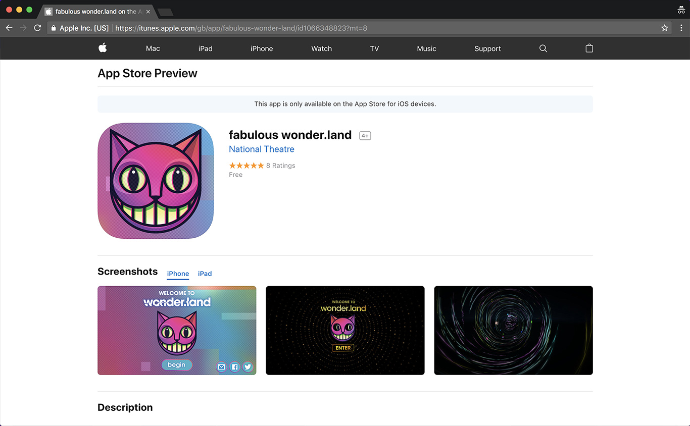 Figure 2.4: Wonder.land app in the App Store, artwork by Michael Cranston and the National Theatre Graphic Design Studio, 2015. Source
2. METHODS OF COLLECTING
The National Theatre still produces printed posters that appear on the street and on the underground. Variants of the posters can also be purchased from the National Theatre shop (often the same image as the programme cover) continuing the tradition of posters serving as collectible souvenirs for performance and events: satisfying paper objects that we want to keep and display in our homes. However, it is important to note that these poster no longer represent the full work. They are no longer a self-contained design entity that ‘packages the play’. As we have seen from our conversations with Charlotte Wilkinson, and our exploration of recent NT marketing campaigns, the poster is one outcome of a core visual idea that is designed to span and link together multiple platforms. Today the design work is not determined by the logic of the printed poster.
To represent the expanded poster on its own terms challenges us to collect it as a distributed design: a collection of offline and online manifestations of the core visual idea.
Printed posters (both the marketing and souvenir versions) and other printed graphic materials (such as programmes) can be collected in the traditional way. The Rich Media online elements of the National Theatre’s marketing campaigns, however, require new approaches to collecting and prompted us to explore how web archiving and Webrecording could be used to capture both the aesthetics of their design and their dynamic functionality.
Initially we looked back to the online marketing of the National Theatre’s production of The Captain of Köpenick in 2013 – one of the campaigns that we had discussed with Charlotte Wilkinson. What became immediately obvious however, was that at distance of five years, very little remained of the online life of this campaign. The forty second teaser trailer was still accessible on the National Theatre’s YouTube channel, together with an ‘Audience Reactions’ trailer (figures 2.5). Beyond that, there were a handful of traces of the visual identity left on listings and ticket sales sites (figure 2.6). The hyperlinks that would have allowed further interaction, however, were broken.
Figure 2.5: Trailer teaser for The Captain of Köpenick on YouTube, artwork by Charlotte Wilkinson and the National Theatre Graphic Design Studio, 2013.
The National Theatre Youtube channel was the only place where content for Captain Köpenick as a past performance remained live. Even here, we discovered that there was something anachronistic about the experience of viewing a clip posted in 2013 within the Youtube environment of 2018. If we look at a historical theatre programme, all the incidental elements such as the advertisements are contemporary with the production. In Youtube, however, a theatre trailer is viewed within a constantly updating framework of advertising and recommendations. The clip is still accessible, but it is somehow out of place.
The online traces of The Captain of Köpenick that remained live online were by now too fragmentary to retrospectively capture in a satisfying way through webrecording. All that was possible was to download some of the static images and the teaser trailer (as discreet files). This, however gives little sense of how the campaign functioned as a dynamic entity. We also considered whether it was possible to recover any of these elements from the UK Web Archive. In conversation with our partners at the British Library, we learned that this is potentially possible, but complex and untested (a research question within a research question). The UK Web Archive comprises a vast, and intricate index of all the URLs that have been captured. This index also lists the URIs (Unique Reference Identifiers) of the elements associated with web pages, including scripts, images, and embedded adverts. The problem is knowing which URIs we are looking for. If original source code for past versions of a website have been kept by a developer, it may be possible to identify the URIs, then with detective work cross-reference these to the index file. More likely, the task would be a combination of semantic analysis and ‘guess work’ to establish what the file name could have been, and on which sites it might have been placed.
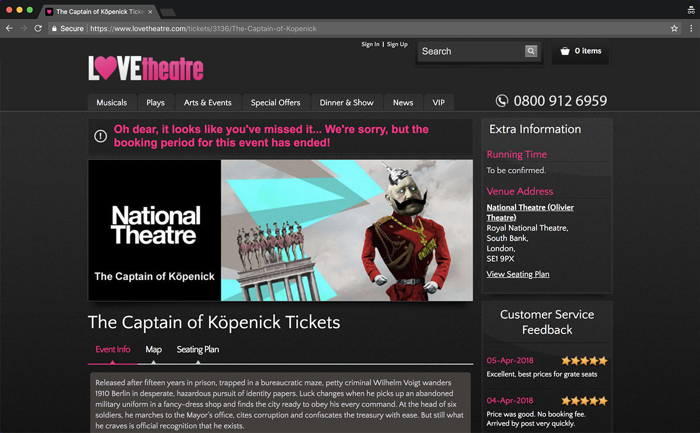 Figure 2.6: Event info for The Captain of Köpenick on Love Theatre website, artwork by Charlotte Wilkinson and the National Theatre Graphic Design Studio, 2013. Source
Attempting to capture The Captain of Köpenick as an expanded poster illustrates that collecting the marketing campaign for a cultural event, is best achieved by taking action while that event is current. This kind of contemporary content on the web displaces itself. It has a limited lifespan based upon the duration of a production or the date of an event. We contrasted the experience of looking back at The Captain of Köpenick with exploring how we could go about collecting a current National Theatre performance: Pinocchio.
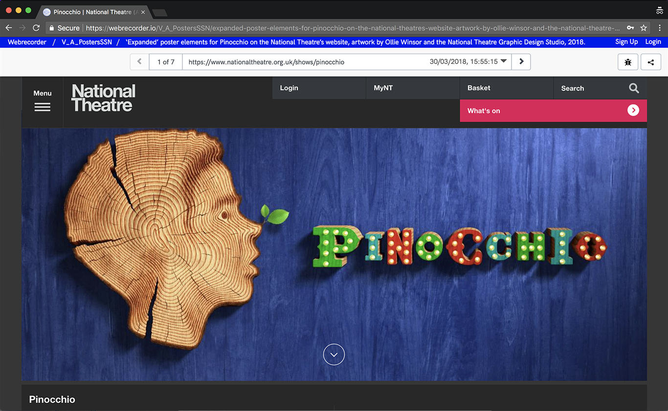
We discovered that the ‘What’s On’ page for Pinocchio on the National Theatre website was a hub for the ‘expanded’ poster for the production. A ‘leaderboard’ image introduced the key elements of the Pinocchio design: a boys head cut out of the end grain of a tree trunk with a green leaf sprouting from the nose and cut out wooden lettering against blue painted wooden planks. This image could be expanded to reveal the synopsis, one line reviews and information on tickets and events with clickable links for further information and booking. Scrolling down the page there was a collection of videos and trailers: audience reactions, behind the scenes interviews and a teaser trailer. Each video ended in a frame with the core ‘poster’ image that served to stitch every element into the whole. In this instance, the 18 second teaser trailer was an animated version of the poster image. We used Webrecorder to capture the ‘What’s on page’ as an expanded poster, clicking to play the embedded videos and following hyperlinks to the box office and online shop (figure 2.7). In addition we decided to collect the teaser trailer as a stand-alone video file, to allow for the possibility of displaying it as a separate component.
3. ELEMENTS OF THE PROPOSED ACQUISITION
- A printed poster and programme
- A Webrecording of the homepage
- Video file of ‘teaser trailer’ (.mp4)
4. KEY FINDINGS
- Traditional poster forms are still in demand, but crucially, they are constituent parts of multi-media campaigns, distributed across a variety of platforms.
- Design work is no longer determined solely by the logic of the printed poster. Campaigns in the digital age are less about iconic images — more about imagery that is flexible across a number of variant formats.
- Static printed advertising posters have expanded to include ‘rich media’ content, such as video and audio, that encourage viewers to interact with and engage with what they see. Webrecording is necessary to capture these interactive elements.
- Contemporary cultural objects on the web are transient, determined by the seasonal programme changes. Digital graphics and links do not persist and therefore collecting needs to be timely.
Notes
1. A recent exhibition ‘National Theatre Posters: A Design History’ at the NT’s Wolfson Gallery (October 2017—March 2018) acknowledged the impact of digital media on the development of their posters, but did not attempt to display material in an online formats. ↩
2. Charlotte Wilkinson quoted in Rick Poynor, National Theatre Posters: A Design History, 2017, p.38 ↩
3. Ibid., p.49 ↩
Read more about the Graphic Events category here.