APPROACHES
Layered Design Objects:
Case Study 1 – David McCandless
1. THE POSTER
David McCandless is one of the designers who allowed us into his studio, where he uses the language of design to translate complex data sets and statistics into visuals. This genre is known as ‘data visualisation’. Data visualisation is about transforming complicated information into succinct, readable design. Formal elements such as scale, shape, colour and gradient become ciphers to express, analyse, and discuss data findings.
McCandless initially trained as a journalist, and his impetus for working with data visualisation was a frustration with the way statistics are misused in public dialogue and in the media. He noticed how the voices of politicians and pages of newspapers give credibility to figures, yet often quote them out of context, and draw obscure comparisons between sources which mislead their listener or reader. In written and spoken forms, large data-sets collected via surveys and polls frequently fail to clarify and explain complex ideas — rather can manipulate and distort our understanding.
McCandless's visualisations are an attempt to communicate statistical data in an accessible, graphic form. The works have been produced as illustrated books, printed as posters, reproduced in magazines and newspapers, and shared on social media. Several of the visualisations have been re-formatted and re-imagined as web-based designs on the Information is Beautiful studio website. His design objective is to makes complex data graspable at a glance, while also allowing a viewer to question and probe what they see. While the visualisations transform information, McCandless is insistent that the connection between designs and their source data is transparent.
Each design is supported by diligent research and laborious fact-checking, and this underlying work is made accessible in accompanying spreadsheets. The spreadsheets cite the name of the source, give the date of publication, and provide a full URL where a reader/viewer can find the original statement, statistic or claim for themselves. In this way, the designs expose the data sources which produce them, and reveal the methods used to gather and classify it.
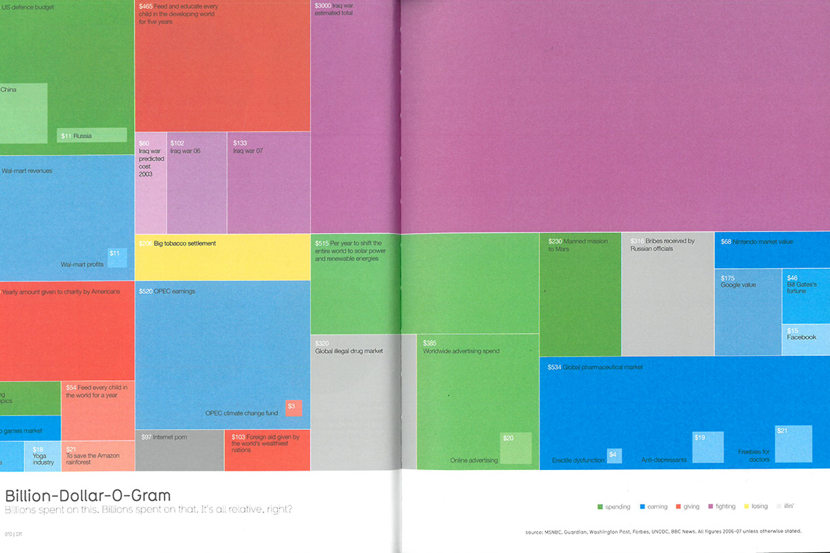 Figure 1.1: David McCandless, ‘Billion-Dollar-o-Gram’, print version, 2009. Information is Beautiful, pp. 10—11. London: Collins, 2009
This co-dependency between design and research data, introduces an idea that the ‘object’ a museum would need to collect to represent the work, is not a single thing, but a compound. The work is both the spreadsheet of citations, quotations and statistics collated from web sources, and the graphic this data produces.
Revealing the way data has been collated is integral to the work, not only conceptually but also formally: the data feeds directly into the designs, literally shaping the visualisations. This happened manually in the early days, but now automatically, using bespoke software (VizSweet) purpose-built by the Information is Beautiful studio.
Another critical feature and point of interest in the work, is its capacity for modification and alteration. In an extended interview, McCandless explained how the source data are periodically reviewed and updated as the known facts change. A first-edition of his book Information is Beautiful was published in 2009.1 It was re-printed in 2012,2 by which time it was necessary to re-work the visualisations, so that their source content was still relevant, and the underpinning data were still correct. In a sense, the printed page had proven too permanent for the kind of fluctuating data the designs depicted. While the less fixed nature of digital design, meant that the web-versions could be updated in the interim, more easily accommodating adjustment and revision, and continuing to reflect contemporary information.
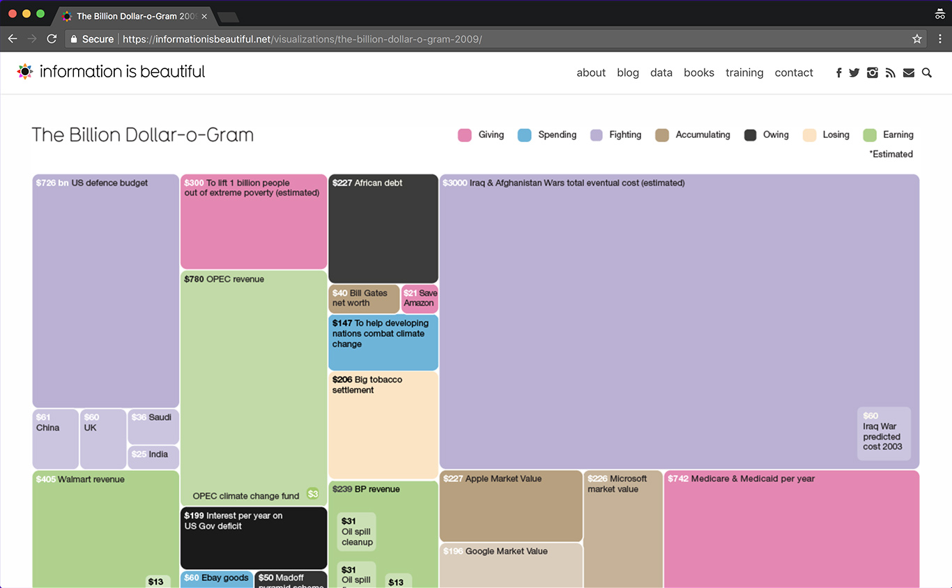 Figure 1.2: David McCandless, ‘Billion-Dollar-o-Gram’, web version, 2009. Source
The visualisations published on McCandless’s website are re-workings of the designs printed in the book. In some cases, re-modelling has been done simply to suit the altered spatial logic of the webpage, which is read top to bottom, rather than left to right, and doesn’t need to allow for the interruption of a book spine. In others, designs have been reinterpreted and given interactive elements which allow an online reader/viewer to engage directly with ‘living’ data.
On the web, the actions of hovering with the mouse or clicking on a particular design component can reveal snippets of text, or link directly to a data source. Some ‘interactives’ are even more intricate: drop-down menus, check-boxes and buttons facilitate filtering and individually-devised re-sorting. So, in digital form, the visualisations become malleable and responsive.
One of McCandless’s earliest experiments with data visualisation became the Billion Dollar-o-Gram, which uses tessellated blocks of different sizes and colours to compare large numbers of billions of dollars – figures which we often hear quoted in the media, but rarely comprehend. Colour is used to categorise the data, meanwhile the scale of the blocks in the design correspond to values such as government spending, corporate profits, and national debt. This graphic became iconic because it visually exposed the impact of the global financial crisis, showing its cost as a relative amount equivalent to the total combined cost of every other value represented in the diagram. Another key factor of the design’s popularity, was that it articulated the gross discrepancy between the predicted and eventual cost of the wars fought in Iraq and Afghanistan. McCandless’s visualisation placed a block corresponding to the published forecast of $60 billion, alongside a block scaled 50 times larger to express the actual cost of $3000 billion.
Figure 1.3: David McCandless, ‘Billion-Dollar-o-Gram’, animated version, 2010.
The Billion Dollar-o-Gram was initially designed to be printed in a publication, and later evolved as a web-based interactive which allows viewers to re-group the blocks by category, or re-arrange them according to value.
In 2009 it was printed in the first edition of Information is Beautiful based upon figures obtained between 2006 and 2007 (figure 1.1). Later that year it was re-designed and re-formatted for the website (figure 1.2). This version incorporated new data and was updated until 2009. In 2010, the design was animated and posted on the studio’s YouTube channel (figure 1.3). McCandless used a variant of this animation in lecture presentations. Standing on stage, he would pose a question, or probe an presumption, meanwhile the design would be plotted on a screen behind him as a sequence of moving images.
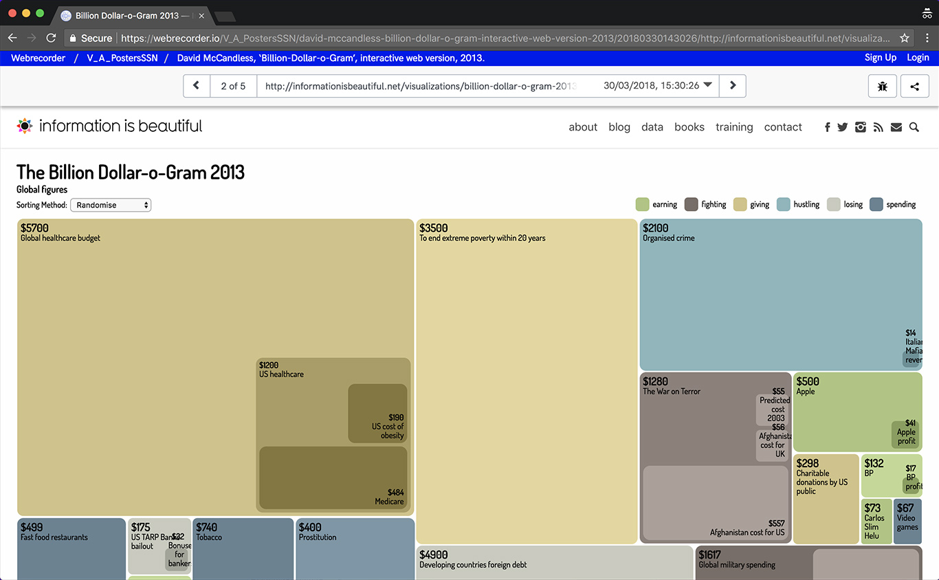
In 2012, the web graphic was translated back into print form (figure 1.4), for a new edition of Information is Beautiful. Then in 2013, the web graphic was revised as an interactive visualisation (figure 1.5), incorporating a menu that facilities re-sorting of the blocks, hover-over captions, and embedded links to data sources. Material transformation, updates over time, as well as variability in situ on the web come to characterise this work.
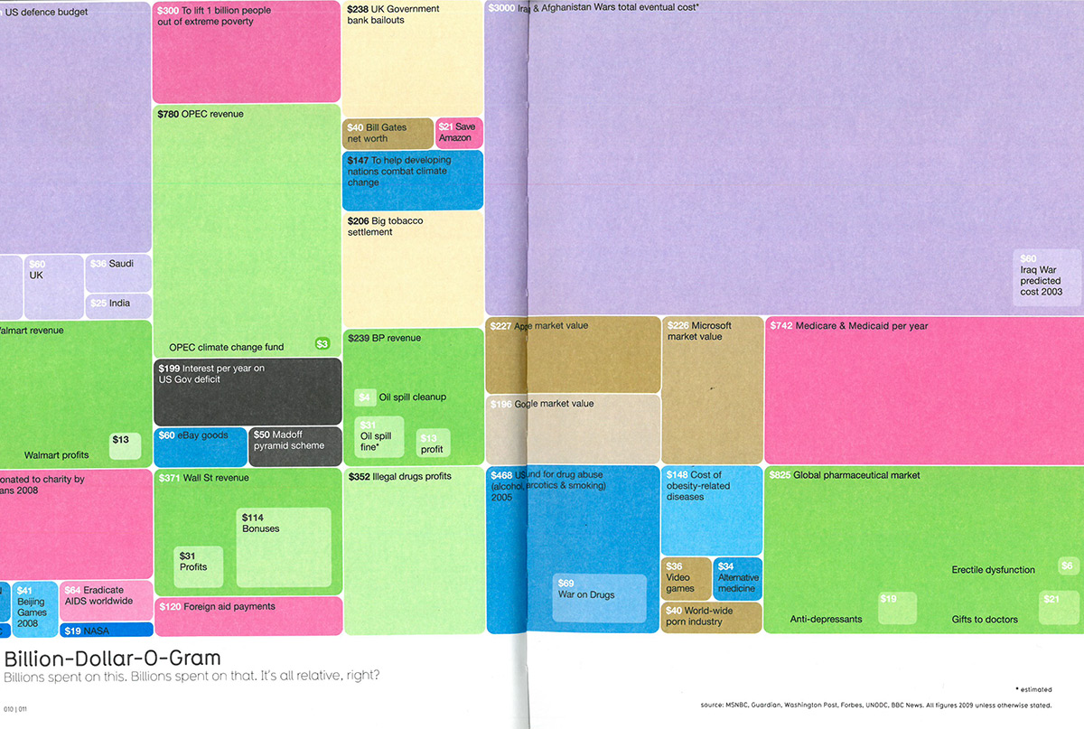 Figure 1.4: David McCandless, ‘Billion-Dollar-o-Gram’, print version, 2012. Information is Beautiful, pp. 10—11. London: Collins, 2012
2. METHODS OF COLLECTING
A) PROCESS
The digital object's liability to change prompted us to investigate the making processes which produce it. It is important for us to understand how objects are designed differently in the digital domain and have an inherent facility for variance, and also to think about how documenting process could help us to collect objects which resist fixity, defying analogue ideals of stability and permanence.
Sitting down in David’s studio, we set about thinking through the specific challenges of collecting digital data visualisation designs. Together at the screen, we began talking about the Billion Dollar O-Gram. It was only as we launched the Photoshop and Illustrator applications, and opened up some of the original files, that we started to get a sense of what the work really is: how it was made, and how its digital form reveals, rather than conceals its material character. As explained above in the Layered Design Objects overview section, we had presupposed that 'the screen always conceals the gestures of making'.
As we opened up some of the original files, that we started to get a sense of what the work really is: how it was made, and how its digital form reveals, rather than conceals its material character.
In the analogue world, museum curators often seek out sketchbooks or rough mock-ups to understand process. We didn’t expect to be able to find the same vein of incremental documentation in the digital studio. Yet, at the screen, we discovered an even more nuanced vantage point was offered. Firstly, we saw how McCandless instinctually devised a version control system, which exploited digital media’s ability for instantaneous replication. Whereby, after each session of work, he saved the file and then duplicated it, so that when tools were taken up again and further changes were made, alterations were performed without changing the previous file. Rather, iterations of the design could be seen evolving sequentially, and any decisions taken or alterations made could be traced, and turned back if necessary. So more than was possible before, we had insight into the gestation of design: when ideas were mulled-over, tested, then discarded or developed.
Not only this, but each file is imprinted with the exact date and time of creation and last modification. We watched how carefully the designer handled this incidental metadata when he was showing us the work, knowing that if he inadvertently re-saved the file, the natural tracks left within the file system would be covered over. Working in this way, he was acknowledging the fragility of this kind of metadata, and reminded us that although it could provide insight, relying upon it could equally mis-guide our interpretation.
Secondly, opening the individual files themselves, we began to understand the craft of digital design. A by-product of McCandless's early system of duplicating files before re-working them, was a cumulative sequence of designs baring successive additions. With experience and hindsight, he reflected that this meant each file was becoming an ever-heavier burden on the hard drive's capacity, but, in the studio that day, we began to gauge how this compounding had also unintentionally preserved a detailed record of each design's development. The digital workspace had provided McCandless with an extendable canvas, surrounded by an infinite pasteboard. Each re-iteration of each version; from hasty sketch to fully-worked design, was accessible by panning around what had become far-stretching workspace, much larger than the screen – analogous only to examining an enormous sheet of paper, which had been pulled this way and that in search of white space for the next drawing.
To make an acquisition which could retain these strains of evidence into the course of development, we agreed to make a selection of files from a range of stages in the design process. Working with the designer, we identified key moments in the design’s genesis – looking for files where significant alterations revealed a change in the course of thinking, or the re-working of a design strategy.
Opening the design files with the software application used to create them, we discovered details about their construction which we noted would not remain accessible if viewed in Portable Document Format (PDF), a format which allows files to be presented independently of the software, hardware and operating systems used for creating them.
Figure 1.6: David McCandless, ‘Billion-Dollar-o-Gram’, screen recording (work-in-progress), 2008.
Exploring the software's various pallets, we learned that the construction of the design could be excavated as layers of content (figure 1.6). During the making-process, layers allow designers to group elements together and then change their position, appearance or attributes without affecting other parts of the design. This functionality makes it possible to manage, adjust and develop the design. Observing the pallet of layers alongside the work, helped us to understand what the design consists of. As McCandless explained his process, we watched as he changed the view on-screen. Clicking his mouse, he selected the specific slices of the design to show us, while clicking to hide others for clarity.
Observing digital works in their pre-finish state; before composite layers were sealed and files were compressed according to their output, we were excited to gain insight into the digital-making process, and to perceive something akin to texture.
In this Case Study, we used QuickTime to create screen recordings. QuickTime is an application used to render audio, video and picture files produced in a wide range of formats. We used one of its additional utilities to record everything that was happening on the computer screen, including movements of the curser and clicks of the mouse. Our screen recording therefore, not only supplies a unique insight to the designer's own view of his on-screen workspace, but also captures the functionality of the software environment, showing the course of navigation and indicating the gestures of manipulation.
We noticed how keyboard commands made within the software environment, revealed a complex framework of gridlines and guide measurements upon which the design is built. This active workspace, also granted us access to the pasteboard space — a reserve area beyond the document's edge, rendered invisible when the finished file is exported to be suitable for publishing — where we discovered elements of the graphic (dormant or thought superfluous at a given stage) were lain.
Seeing elements of the graphic off-page as well as on it, we gained a sense of the digital designer working at a studio desk, surrounded by tools and the detritus of creativity: part-finished fragments, rejected ideas (figure 1.7).
Figure 1.7: David McCandless, ‘Billion-Dollar-o-Gram’, screen recording (work-in-progress), 2009.
QuickTime can overlay the screen recordings with the sound of our voices, so as we clicked through successive versions of the design, we talked about the thought process that shaped it. The resulting document gives a detailed overview of the project. It combines a visual tour with direct narration, in the form of a natural conversation between curator and designer.
B) ENCOUNTER
The Billion Dollar O-Gram’s formal variability influences how people encounter it. As it shifts materially from page to screen, and as it is updated over time, it is experienced differently.
In all formats, the connection between design and the research data is key. Although McCandless has produced data visualisations for print as well as web output, every design (including those for which exist solely on the page) are intrinsically embedded in the online realm. From identification and consultation of resources, to the actions of scraping, recording and hosting the data; the internet serves as primary workspace, tool and subject matter (his work is to some extent about the internet as a source of information). So these visualisations not only depict content drawn from the web, but are produced and manifest using it.
Both print editions of Information is Beautiful, explicitly credit research data obtained from the internet as the underlying structure for the visuals. Each design in the books makes reference to the web sources; however citations remain brief and general.
McCandless’s subsequent publication, Knowledge is Beautiful goes further, providing shortened URLs at the foot of each design. When keyed into a browser, these connect the printed page with a spreadsheet hosted online. Although the Billion Dollar-O-Gram itself does not feature in this book, exploring the links provided there, we were able to find a broader list of data sheets, including those relating to iterations of the design under investigation in this Case Study.
By printing shortened URLs in his book, McCandless is harnessing the web as an opportunity to present the resources he has consulted, and attain transparency in the designs. While, again he is (implicitly) acknowledging the limitations of the book, which cannot effectively contain the plethora of online sources from where the research data has been mined.
So, McCandless encourages a reader/viewer to retrace his pathway from data to visual, but in print this relies upon purposeful following up, from offline to online. However, when the data visualisation are experienced as ‘interactives’ on the web, the research source is quickly and directly accessible, both in list form (Information is Beautiful’s own spreadsheets) and also in original form –– via hyperlinks to the webpage where the data was found (a mixture of published reports in PDF format, online news reports, journal articles etc.).
Encountering the 2013 design on the Information is Beautiful website, the corresponding data sheet can be reached by clicking on a link labelled ‘see the data’. The spreadsheets is readable, but not editable by members of the public, so provides transparency without compromising authenticity. We agreed that this data sheet represented one part of our composite object. Each entry on the spreadsheet includes an external link to the specific webpage where the statistic was cited. McCandless reflected on the difficulty of ensuring the longevity of those external links, and explains that the authority of the data remains important, even if it’s out of date:
That’s where the trust layer comes in, if people click through to a spreadsheet behind an old image and find a couple of dead links — they’ll have to trust me. They’ll think, he’s got the web address, he’s got the source name, at the time this was authoritative and links do die… I think there’s a little bit of a buffer there, a trust buffer if you like.3
Indeed, excavating these links, we found breakages. We reflected that, collecting in a responsive, rather than retrospective way, it would have been possible to capture the contemporary live links. Moreover, we thought about how useful a tool like Webrecorder could have been to McCandless during the process of making and documenting his own work. It would have allowed him to capture the websites at the time of citing them, thereby annulling his concerns about link-rot. Instead of re-directing to the live web, the links could re-direct to archived pages, which are clearly labelled as captured on a specific date in the past. In this way, the Network’s experimentation with new collecting tools could potentially feed back into the design workflow.
The external web sources are not only accessible by digging into the data sheets. A click on any one of the coloured blocks in the 2013 interactive iteration of the design, also redirects to the relevant cited webpage. These pages thus become a natural and appropriate contingent of the interactive work. As curators and collectors we were prompted to re-think where the online objects’ edges are. Users do not encounter each design as self-contained. Rather, their understanding is based on the fact of its embeddedness, and is developed through exploration of its linkages to external assets. Recognising this, was a further clue that acquisition of a discreet object would no longer be adequate. To more fully and authentically represent the Billion Dollar-O-Gram, we agreed to capture (at least a minimum) of the context within which it is encountered.
Our challenge was therefore making a decision about which of the external data sources to collect. In discussion, we have characterised this process of negotiation as ‘drawing a boundary’ around our object. The negotiation is both practical and conceptual. It is a question of feasibility, as well as a question of meaning: which parts gathered together will constitute a reasonable whole. In this case, we decided that a boundary delineated by a single ‘link-hop’ would suffice (capturing each external webpage within the distance of one click from a block in the design). We used Webrecorder to collect this work, enacting each mouse click in order navigate to the hyperlinked destinations, so that they too would form part of our object.
In this dynamic variant, brief citations can be exposed by hovering, while data sheets and sources can visited by clicking. However, there is a further extension to the possibilities of encounter. No longer limited to reading/viewing the image, users are given the opportunity to experience it in several ways. Using a drop-down menu it is possible to categorise or randomise the visualisation. These variable views of the design would elude traditional web archiving technologies, which rely on automated crawlers to survey and capture websites.
Using Webrecorder we can capture the interactivity of the design. By performing the actions of filtering, hovering and clicking we preserved the encounter, defining a multi-faceted and multi-spatial object, which when viewed later by a researcher can be interacted with by way of those same gestures.
3. ELEMENTS OF THE PROPOSED ACQUISITION
- A selection of Illustrator files (.ai) from a range of stages in the design process
- A screen recording (.mov) created with QuickTime to capture the functionality of the software environment
- First and second editions of the Information is Beautiful book (Collins: London, 2009; 2012)
- 2009 static web version alongside its data sheet (WARC) created with Rhizome’s Webrecorder
- 2010 animated variant of the design alongside its data sheet (WARC) created with Rhizome’s Webrecorder
- 2013 interactive web version alongside its data sheet + external links (WARC) created with Rhizome’s Webrecorder
4. KEY FINDINGS
- Web archiving technology enables capture of works that are contingent upon links to online content, or are enlivened by web user interactivity.
- The digital design process can be collected, but relies upon a proactive curator working alongside a designer as close as possible to the time of production.
- Within their native software environments, digital objects can reveal processual textures and gestures.
- Utilising a range of capture methods increases our chances of maintaining access to a work and retaining a record of its live character. Collecting a mix of file types provides some insurance against format obsolescence.
Notes
1. Billion-Dollar-o-Gram, published in Information is Beautiful (London: Collins, 2009), pp. 10—11. National Art Library General Collection 603.AL.1078 ↩
2. Billion-Dollar-o-Gram, published in Information is Beautiful (London: Collins, 2012), pp. 10—11. National Art Library General Collection 603.AQ.0166 ↩
3. Conversation with David McCandless, 2016 ↩
Read more about our next case study here